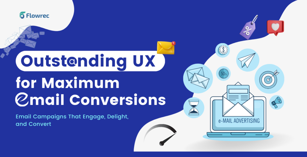
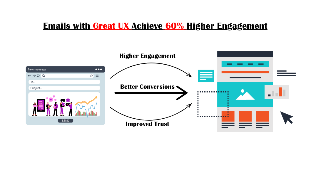
Emails are one of the most powerful tools for businesses to connect with their audience. But what happens when a customer clicks on that carefully crafted email? If the landing page they’re directed to doesn’t live up to their expectations, all your hard work goes to waste. Many businesses struggle with high bounce rates and poor conversions because their landing pages fail to deliver on the promises made in their emails.
This disconnection can frustrate potential customers and tarnish your brand’s credibility. To overcome this pain point, it’s essential to pair effective email marketing strategies with a well-thought-out landing page user experience (UX). A landing page that is visually engaging, easy to navigate, and aligned with the email’s message can turn curious visitors into loyal customers. In this guide, we’ll show you how to craft a seamless journey between your email campaigns and landing pages, ensuring you capture and retain your audience’s attention.
Combining effective email marketing strategies with thoughtful landing page UX design creates a seamless journey for your audience. This guide will show you how to create a compelling landing page for email collection templates while focusing on user-friendly design principles to maximize results.
Table of Contents
- Why Landing Pages Are Essential for Email Marketing
- Key Features of an Effective Email Landing Page
- How UX Principles Enhance Email Landing Pages
- How to Combine Email Marketing and UX Design
- Examples of UX-Optimized Email Landing Pages
- Why Choose Flowrec Solutions for Your Landing Page Needs?
- Conclusion- Merging Email Marketing with UX Excellence
Why Landing Pages Are Essential for Email Marketing
Landing pages are a vital part of any email marketing campaign. They provide a focused space for visitors to take action, turning interest into measurable results. Here are the key reasons why landing pages are essential:
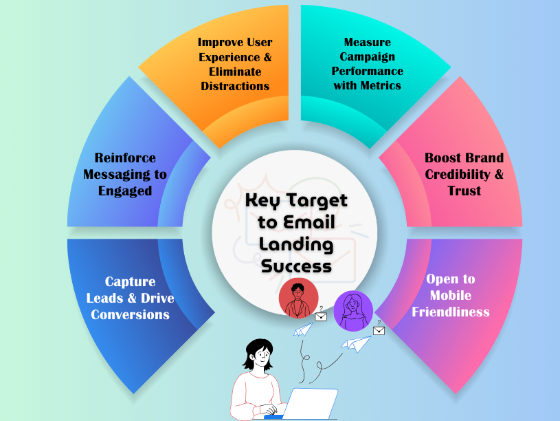
- Drive Conversions: Landing pages are designed with a single goal — to convert visitors. Whether it’s capturing leads, promoting a product, or collecting email addresses, a well-structured landing page increases the chances of success.
- Reinforce Messaging: A landing page ensures that the visitor’s journey is seamless. When the design and content align with the email, it reassures users that they are in the right place and keeps them engaged.
- Improve User Experience: A landing page eliminates distractions, guiding visitors to the intended action with clear visuals and messaging. This streamlined experience reduces confusion and enhances satisfaction.
- Measure Campaign Performance: Landing pages make it easy to track metrics such as click-through rates, conversions, and bounce rates. These insights help businesses evaluate the effectiveness of their email campaigns and refine strategies.
- Boost Brand Credibility: A well-designed landing page that matches your brand’s tone and style fosters trust. Visitors are more likely to engage when they feel the page is professional and authentic.
- Enhance Mobile Engagement: With most emails opened on mobile devices, having a landing page optimized for smaller screens ensures you don’t lose potential customers due to poor design or usability issues.
By prioritizing landing pages as part of your email marketing strategy, you create a cohesive and compelling experience that drives results and builds stronger relationships with your audience.
Key Features of an Effective Email Landing Page
A great email landing page bridges the gap between your email campaigns and your desired action, whether it’s capturing leads, promoting a product, or driving sign-ups. To ensure your landing page performs at its best, it must include specific features that align with user expectations and marketing goals. Here’s what makes an email landing page truly effective:
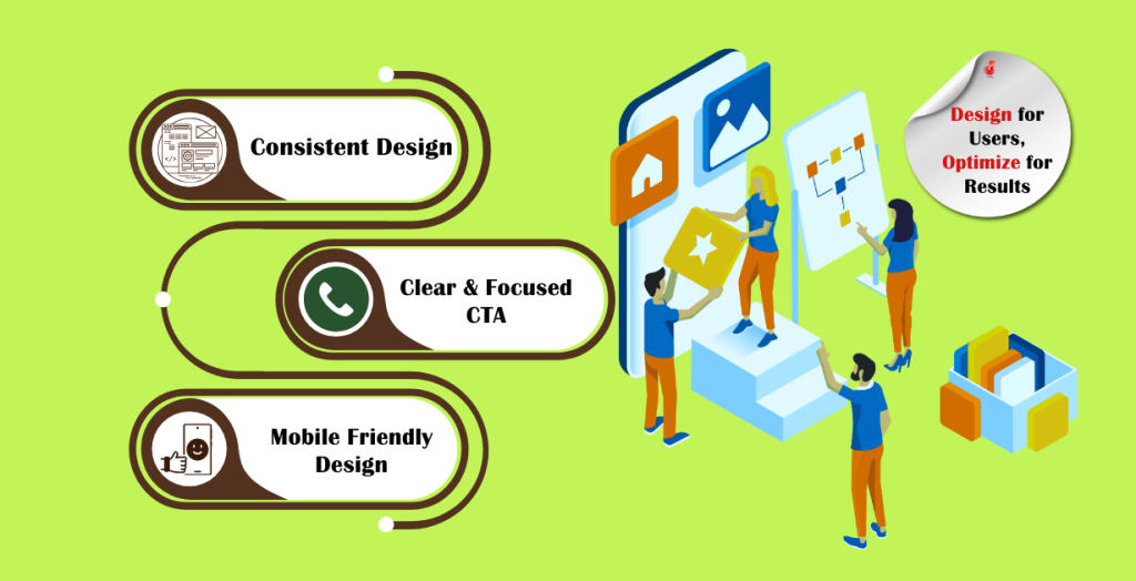
1. Consistent Design
Consistency between your email and landing page design builds trust and ensures visitors feel they’re in the right place.
How to Achieve This:
- Match the email’s color scheme, typography, and imagery with the landing page.
- Use the same tone and messaging from your email to create a seamless transition.
- Keep the branding elements, such as logos and taglines, consistent across both platforms.
Example: A summer sale email featuring bright, tropical graphics should lead to a landing page with similar vibrant visuals and related promotions.
2. Clear and Focused Call-to-Action (CTA)
Your CTA is the centerpiece of your landing page and should guide visitors to the next step clearly and confidently.
Best Practices for CTAs:
- Use direct, action-oriented language like “Start Free Trial” or “Get Your Discount.”
- Place the CTA button above the fold so visitors don’t need to scroll to find it.
- Design the button with a contrasting color that grabs attention and stands out from the background.
Pro Tip: Reiterate the CTA throughout the page, especially after detailing key benefits or features.
3. Mobile-First Design
With a significant portion of users accessing emails and landing pages on mobile devices, optimizing for smaller screens is critical.
Key Steps for Mobile Optimization:
- Use a responsive layout that adjusts seamlessly to different screen sizes.
- Ensure touch-friendly navigation with large, tappable buttons and minimal scrolling.
- Test the page’s loading speed to avoid delays that could frustrate users.
Example: A well-optimized mobile landing page will feature vertically stacked content, eliminating the need for horizontal scrolling.
4. Simple and Relevant Content
Content should be concise, clear, and focused on the visitor’s needs. Overloading the page with unnecessary details can distract from the goal.
What to Include:
- A headline that communicates the core value proposition in one or two lines.
- Short, benefit-focused copy that highlights how the user will gain value.
- Testimonials or statistics that back up your claims.
Pro Tip: Use bullet points or numbered lists to make the content scannable and easy to digest.
By incorporating these features into your email landing pages, you’ll create a user-friendly experience that increases engagement and drives conversions.
How UX Principles Enhance Email Landing Pages
Applying UX design principles to your email landing page ensures a seamless and engaging experience for visitors. Here are key areas where UX makes a difference:
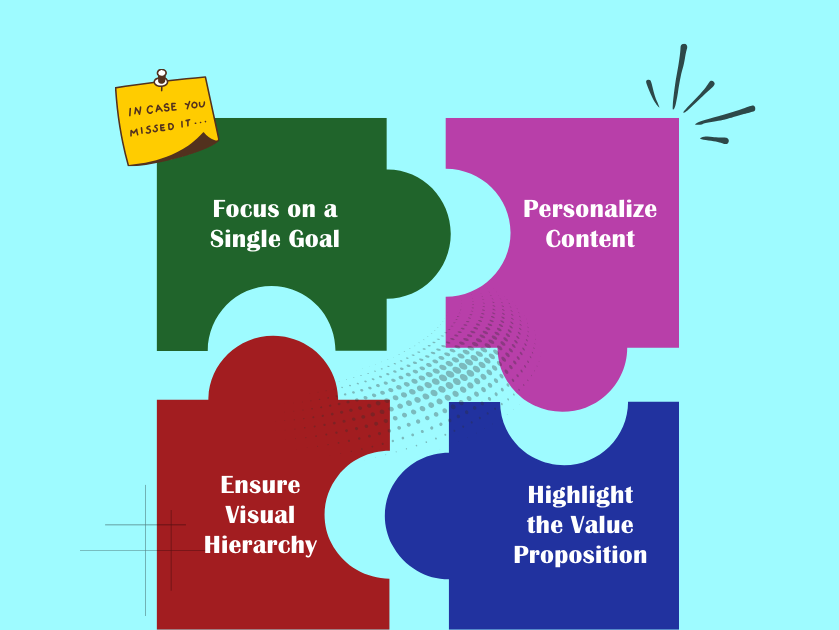
1. Simplicity and Clarity
Visitors should immediately understand the purpose of the page and how to take action. Avoid clutter and keep the focus on your CTA.
What to Do:
- Use concise headlines and straightforward messaging.
- Eliminate unnecessary elements that might distract users.
- Arrange content in a logical flow that guides users toward the CTA.
2. Visual Hierarchy
A good landing page UI design uses visual cues to direct attention to important elements.
How to Apply:
- Use larger fonts and bold colors for headings and CTAs.
- Place key information where the eye naturally falls, such as the center or top-left.
- Include whitespace to make the page more readable and less overwhelming.
3. Trust-Building Elements
Adding social proof, testimonials, or security badges can reassure visitors and encourage them to act.
Examples:
- Include a short testimonial near the CTA: “This guide helped me double my leads!”
- Display trust badges like “Secure Payment” or “No Spam Guarantee.”
How to Combine Email Marketing and UX Design
Email marketing and landing page design go hand in hand. When executed well, they create a seamless experience for users, guiding them from curiosity to conversion. Here’s a more detailed guide on how to merge email marketing strategies with UX design:
1. Align the Email and Landing Page Design
Your email and landing page should feel like two parts of the same story. This consistency reassures visitors and keeps them engaged.
How to Do It:
- Match the email’s design elements — such as fonts, colors, and imagery — with the landing page.
- Ensure the tone of your email content flows naturally into the landing page copy.
- Include the same headlines or key phrases from the email on the landing page to reinforce the message.
Example: If your email highlights a limited-time discount with bold red visuals, the landing page should echo this urgency with similar red CTAs and messaging.
2. Personalize the User Experience
Personalized landing pages increase engagement by catering to specific audience segments or user behaviors.
How to Do It:
- Use email marketing tools to segment your audience based on preferences, location, or previous interactions.
- Create multiple landing pages tailored to each segment. For example, an email promoting “Spring Travel Deals” could lead to destination-specific landing pages.
- Incorporate dynamic content, such as personalized greetings or product recommendations, on the landing page.
Why It Works: Personalization makes visitors feel understood, increasing the likelihood of conversion.
3. Streamline the User Journey
The transition from email to landing page should be effortless, guiding users to take action without confusion.
How to Do It:
- Simplify navigation by removing unnecessary links or distractions on the landing page.
- Keep the page layout intuitive, ensuring the CTA is prominent and easy to find.
- Use clear and concise copy that reinforces the email’s promise.
Example: An email promoting a free eBook should lead to a landing page where users can quickly fill out a form and download the resource.
4. Test and Optimize Regularly
A/B testing ensures your email campaigns and landing pages are performing at their best. Continuous optimization improves the user experience over time.
What to Test:
- Test different email subject lines, headlines, and CTA button styles.
- Experiment with landing page layouts, colors, and imagery to see what resonates most with your audience.
- Measure key metrics like bounce rates, click-through rates, and conversion rates to identify areas for improvement.
Pro Tip: Regularly update your designs based on performance data to keep your campaigns fresh and engaging.
5. Focus on Mobile Optimization
With more users accessing emails and landing pages on mobile devices, ensuring a mobile-friendly experience is critical.
How to Do It:
- Use responsive design so that both emails and landing pages look great on all screen sizes.
- Make buttons and forms easy to interact with on smaller screens.
- Test loading speeds to avoid frustrating delays for mobile users.
By combining these strategies, you’ll create an email marketing experience that seamlessly integrates with your landing pages, delivering results that align with your business goals.
Examples of UX-Optimized Email Landing Pages
Great examples of UX-optimized email landing pages demonstrate how thoughtful design and clear messaging can drive user engagement and conversions. These companies have mastered the balance between simplicity and functionality, ensuring visitors have a seamless and effective experience.
1. Dropbox Business Free Trial Page
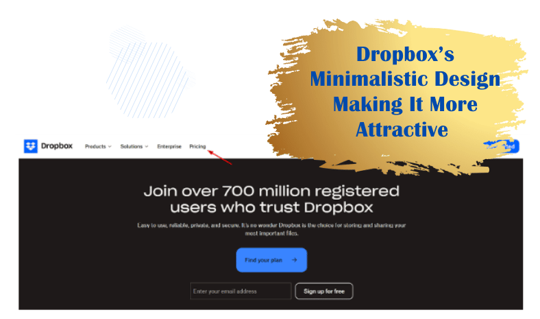
What Works: Simple design with a clear CTA (“Start Your Free Trial”). The page uses whitespace effectively, making the content easy to digest.
UX Highlight: Mobile responsiveness and fast load times ensure a smooth experience.
2. HubSpot eBook Download Page
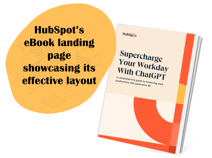
What Works: Engaging visuals and a short form that doesn’t overwhelm visitors. The CTA (“Get the eBook”) is prominent and repeated.
UX Highlight: Trust elements like “100% Free” reassurance and concise benefit-driven headlines.
3. Airbnb Host Sign-Up Page
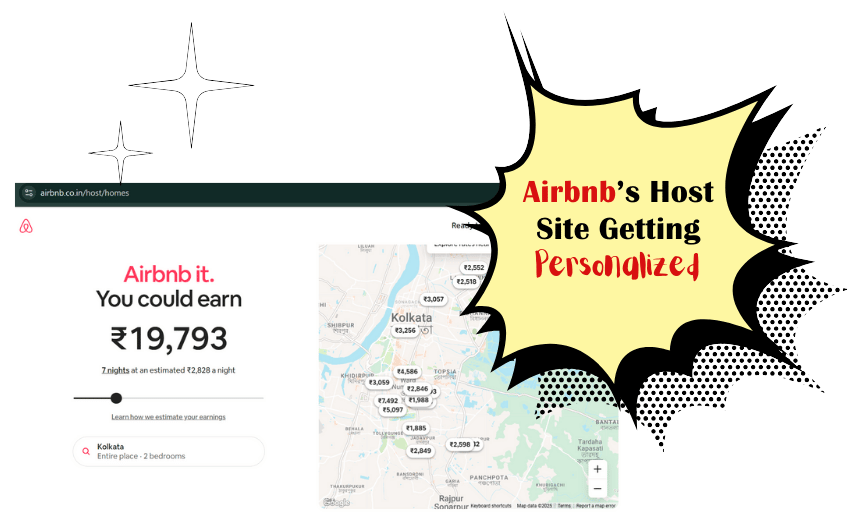
What Works: Personalized messaging tailored to the visitor’s location. The design is sleek and visually engaging, with a clear path to sign up.
UX Highlight: Interactive elements like sliders and dropdowns make it user-friendly.
Why Choose Flowrec Solutions for Your Landing Page Needs?
At Flowrec Solutions, we understand the unique challenges businesses face when creating landing pages that convert. That’s why we combine cutting-edge technology with creative expertise to deliver high-performing landing pages tailored to your goals. Whether you’re looking for a landing page for email collection templates or an overhaul of your current designs, we ensure every page is crafted to resonate with your audience and drive measurable results.
With a focus on seamless landing page UX design, our team works to simplify the user journey while enhancing engagement. Let us help you turn clicks into customers and ideas into impactful campaigns.
Contact Flowrec Solutions today to create landing pages that truly deliver results — it’s the step your business deserves to take.
Conclusion- Merging Email Marketing with UX Excellence
The success of your email campaigns depends on what happens after the click. A well-designed landing page that prioritizes user experience can make all the difference in converting visitors into customers.
By combining email marketing strategies with landing page UX design, you create a cohesive and effective journey for your audience. Use the tips and examples shared here to elevate your landing pages. For more insights, explore these related blogs:
Start enhancing your landing pages today and watch your email campaigns achieve their full potential.
###


